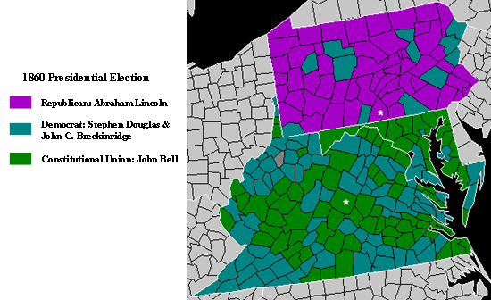
While this map succeeds in portraying a good amount of information in a simple fashion it is still horribly overwhelming to look at. Whoever decided to use these colors must have been asleep at the computer. The bright purple distracts from focusing on the map’s data itself. Other than the poor choice of ascetics the map is not that bad and can be tolerable and provide some fascinating information.